Google Maps redesigns bottom bar for Android user: Check whats new
8 months ago | 109 Views
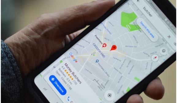
Google Maps is one of the most popular navigation apps around the globe. Just like its other services, Google keeps updating the Maps app to enhance its convenience and ease of usage for users. Recently, Google Maps got a bunch of new features and now, the company has started to roll out an app redesign for Android users. The bottom bar redesign for the app was first announced at Google I/O 2024 event.
What's new in the Google Maps redesign
Google Maps has redesigned its bottom bar, now featuring three tabs instead of five. The "Go" and "Updates" tabs have been eliminated, while "Explore" remains unchanged. The functionality of the "Go" tab has shifted to the ?Saved trips? function, which can be found under your lists in the center of the feed.
The "You" tab is the new name for the saved option, with no significant changes in its content and the bookmark icon remaining in its usual place. Messages and notifications previously found under the "Updates" tab, now called "Following," have been moved to the "Explore" tab, located at the top right corner. The search bar has also been removed from this tab.
Above the redesigned bottom bar, users will find the tall search tab that was previously only visible in the top section of the Discover stream. The "Contribute" option remains unchanged.
The update has streamlined app navigation, making it cleaner with three tabs instead of the cluttered tabs seen on the Google Homepage. It introduces Material 3 elements, such as a pill-shaped tab indicator that was present on iOS but removed from Android shortly after.
This redesign is based on the sheet-based redesign introduced on Android earlier this month. These changes are not yet available on iOS. Users can explore the redesigned bottom bar with version 11.138 x of Google Maps on Android. If users are unable to see the update, they can force-stop the app to refresh it.
#


