Wallpaper is trending again. Sort out your hang-ups here
7 months ago | 68 Views
Everything you knew about wallpaper – peel it off, tear it away. Granny florals are long gone. Geometrics are in. Textured finishes are doing what paint and plaster cannot. And for undecided Millennials, smaller decals are seamlessly covering up unsightly doorframes and corners. Might the new wall decor be just an oversized laptop sticker? Design experts tell us why they’re excited about the idea.
Talk of the ton
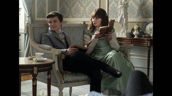
The best thing about peel-and-stick home decor? You can stay on top of interior-design trends and change a room’s look on a whim. Renters love it. So do fans of Bridgerton – Regency-themed looks have been all the rage this year, but in small doses. Consider using powder-blue backdrops only in a sunlit corner of a single room, or Penelope Featherington’s bright yellows on the wall behind the headboard. Or pale-pink florals to set off the vanity. “They’re the budget-friendly secret to keeping interiors fresh,” says interior designer Namrata Saigal. “They also let you personalise a space and get instant glam without making a long-term commitment.”
Shuchi Jain, an interior designer based in Indore and founder of Studio Shuchis Traces, says that modern wallpaper also doesn’t add bulk to walls. “Prices start from as little as ₹10 per square foot, or 500 rupees per roll, though rolls can cost as much as ₹45,000,” she says. Many people simply paper over a part of their home, switching it out for another look long before it starts to peel away.
Neon infusion
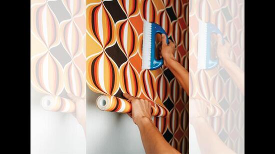
On walls, fluorescent touches act much like highlighters on a document. They’re bright, they tell you where to look. “Abstract neon patterns, inspired by retro and pop styles, infuse spaces with energy, making them vibrant and dynamic,” says Saigal. Use them in small doses – a bright motif among a palette of pastel stripes, a fuchsia border running along the cornice or skirting.
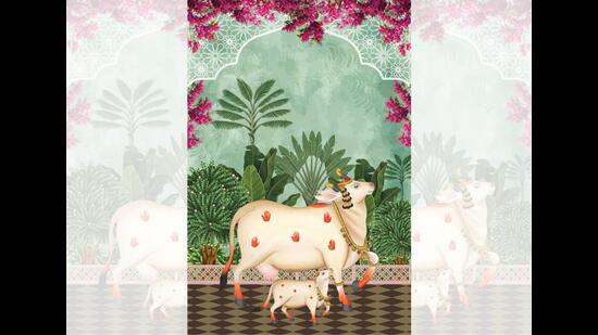
Another trend: Customised wallpaper featuring motifs that reflect the homeowner’s interests, says Saigal. A biker-life mural is perfect for travel-content creators who are filming from home between trips. A floor-to-ceiling image of a tropical forest livens up a window facing the concrete jungle. Trippy patterns work well for a yoga-loving couple. A kolam or handloom motif, running along the borders, is a subtle reminder of one’s hometown.
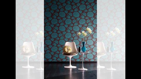
Botanical decals – they’re on maxi dresses, saris and tote bags – are great for the entryway to the plant-filled backyard or balcony. Aamir Ansari, a wallpaper designer from Mumbai, says that tropical themes have been a big trend, “transforming spaces into exotic sanctuaries”.
Florals, for those who simply must have them, look less dowdy than before. When in doubt, pick geometric patterns over watercolour motifs, look for unusual textures rather than flat greeting-card rip-offs. Consider a deep but muted backdrop, set off by decorative blooms to create depth and drama. “From Art Deco geometrics to retro florals, there’s plenty to pick,” says Ansari.
Bite size hacks
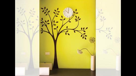
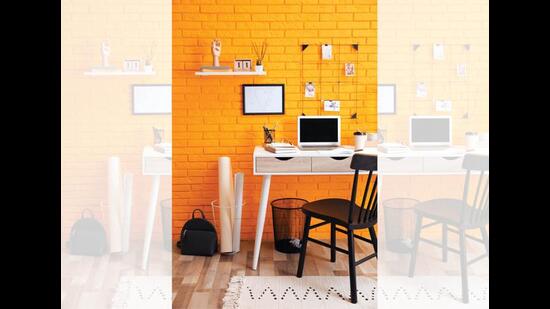
Small homes need small hacks. Not a whole wall covered in a texture or print, but just a stick-on design that fills a corner, the back of the work desk, the kitchen counter. Kids’ rooms have been using them for years, with decals that get updated from fuzzy animals to skateboarding silhouettes as the child’s interests change.
As always, adjust wallpaper dreams to the size of your home. Thick vertical stripes add height. Light colours give the illusion of space. “Reflective finishes bounce off light; large-scale patterns reduce visual clutter; textured designs add depth; accent walls draw the eye; and continuous patterns extend visual space,” says Jain. “Opt for monochromatic schemes for seamless flow and minimalist designs to make rooms seem airy.”
Follow the style sheet
Satish Parab, interior designer and founder of SSP Infratech in Mumbai, says that most first-timers select wallpaper after seeing only a small sample. “This makes it hard to visualise the full impact of the pattern in their home,” and often leaves homeowners disappointed in the final look. Take photos of your walls with the lights on and off, and ask the store to create mockups. It offers a better idea of what a print will look like spread out on a whole wall.
And think out of the wall. “Wallpapers can be used on ceilings, wardrobe fronts, the backs of open shelves, or even framed as bespoke artwork,” says Saigal. Just account for some visual relief or breathing space, in case the patterns get too overwhelming.
Read Also: The power of dad jokes: Fun as the ingredient for healthy parenting


